Jules Cheret & Eugene Grasset
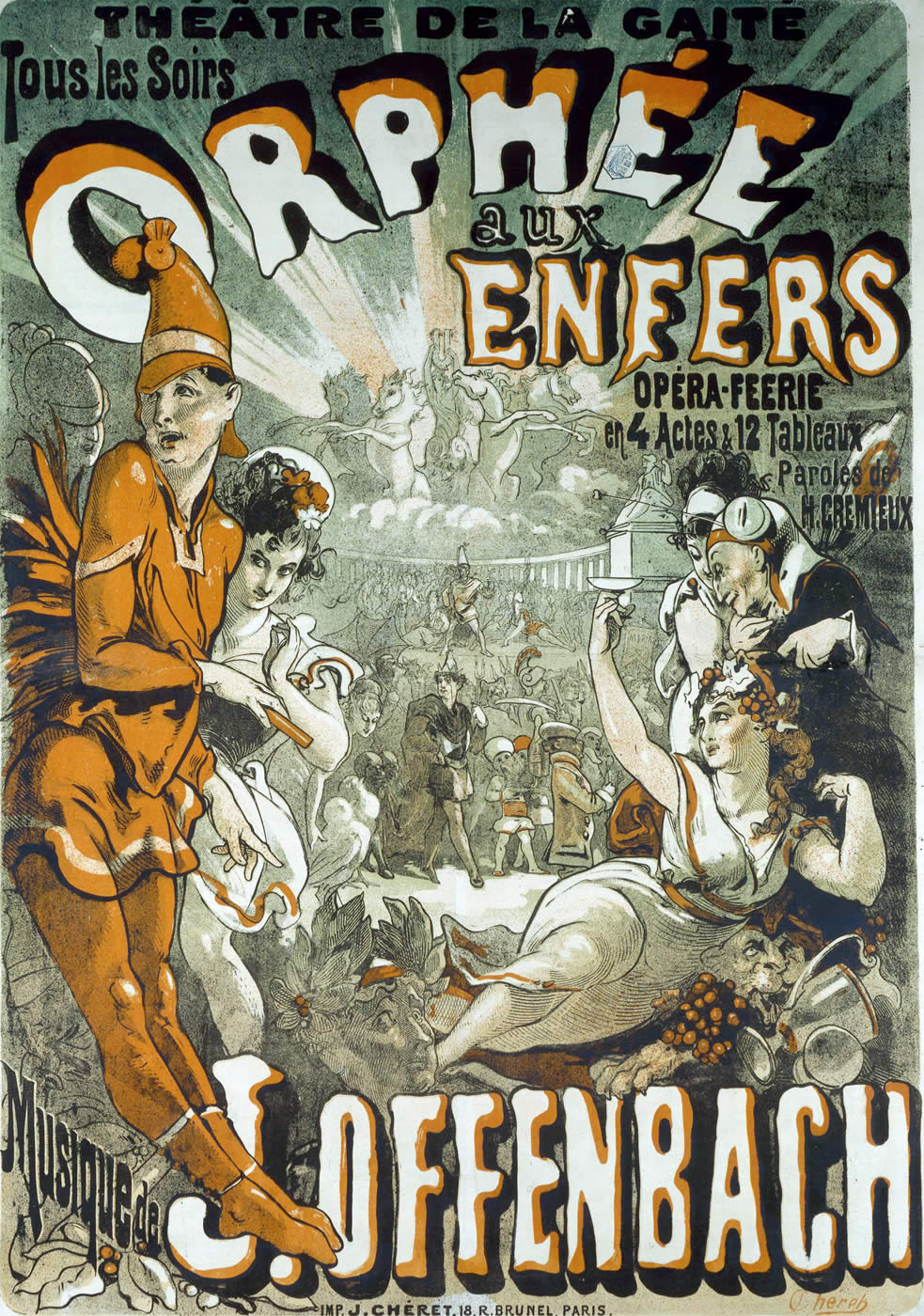
Cheret traveled back to London and there is where he learned the more advanced English color lithography. He moved away from the complex designs of Victorian and simplified his designs making his figures and lettering larger. Cheret designed his new innovated drawings with bright colors consisting of blue, yellow, and red. He introduced a new type of role model for women, "Cherettes" this was a depiction of a self-assured women who were happy and living life to the fullest. Cheret opened up and almost liberated women to be what they want to be, the image to the left is an example of the Cherettes.
Now Eugene Grasset was Swiss-born and was Cheret's rival for public popularity. Grasset studied medieval art and he was also influenced by Asian art. This influence was reflected a lot in his designs, take for example his title page for "Histoire des quatre fils Aymon" above.
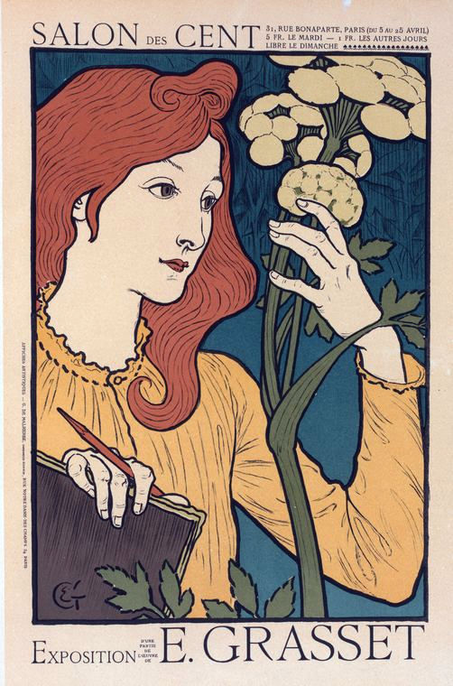
Not only was his design style different he also depiction of women was in opposition of Cheret's "Cherettes". Instead of being outspoken and self-assured, Grasset's exhibition poster (above) displays the women having a traditional attitude with flat or muted colors. The women above also appears to be quiet and maybe even contemplative. They are quite different yet still played important roles in the transition from Victorian to Art Nouveau. Although their designs contrasted each other they both were influenced either by the arts and crafts movement(Cheret) or the Ukiyo-e designs(Grasset).
Tuesday, October 30, 2012 |
Posted by
Unknown
at
11:47 PM
0
comments
![]()
Advertising Past & Present
After reading chapters 9 and 10 I found the rise of American editorial and advertising design quite interesting.
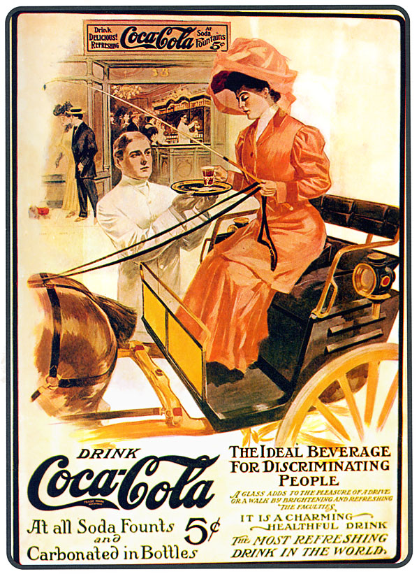
I'd imagine persuasive selling has been around for an extremely long time. But when it's in the Victorian Era in the golden age for graphic design it must have been ingenious to use imagery to sell your product. I found a few images of old and new advertisements to compare.
Tuesday, October 23, 2012 |
Posted by
Unknown
at
10:04 PM
0
comments
![]()
Typography
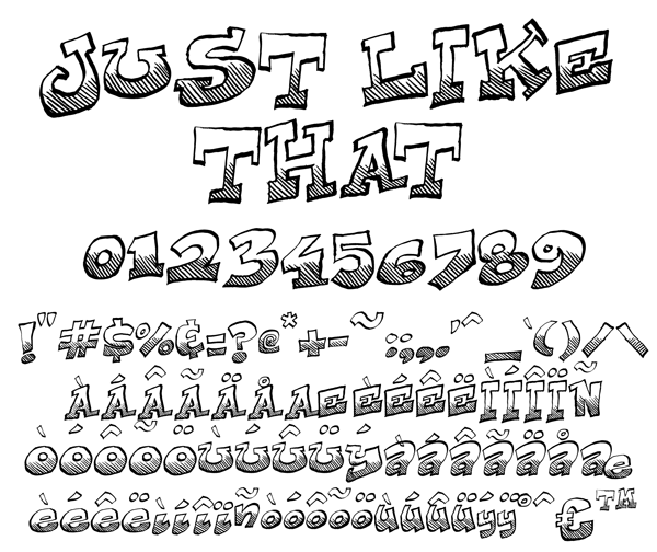
This weeks reading was a bit boring and long. I did come across a few interesting topics. William Caslon was a big dog when it came to type design. Apparently his styles were used for 6 decades! Also his fonts were used in the printing of the Declaration of Independence. How cool! This was out of left field I didn't foresee the bridge between Europe and the American Colonies. Which brings me to a website I stumbled upon in my research. I found this really neat website that has a bunch of user created fonts, not typeface but it appears to be just another innovation of typography. These fonts are at a range of intricacy and even utter simplicity. After reading the chapters assigned, I was able to better connect with the history of typography with our present day typography and how it is used in graphic design for an endless amount of things. Like billboards, magazines, books, movie titles/covers, posters, websites, logos, etc. I am glad though that we don't have it as hard as they did, with making paper, and printing presses. It seems to be easily accessible for anyone in the 21st century.
Wednesday, October 17, 2012 |
Posted by
Unknown
at
12:38 AM
0
comments
![]()
Learning Arabic...
Ok to start it off I like to express my initial feelings and emotions. I am again overwhelmed, but more intrigued. I was very interested in the evolution of language. I had never before thought about how it all started, but here I am typing the English alphabet to form words with my keyboard. It makes me think of the invention of the movable type. how it has progressed and innovated. From printing presses and typewriters.
Also on a different note I did my own research but my source is actually from a family friend who has converted to Islam and is currently learning Arabic while pursuing his PhD in African Studies. His name is Michael Fattah. I went with him to the east bay recently and I wanted to ask him questions about Islam and why he converted. He never really believed in religion although he was taken to church as a child. He was a boxer at one time in his life and one of the guys he trained with tossed him a copy of the Qur'an. At first he rejected it but his sparring buddy made a really persuasive argument. He began to do some reading and felt whole, I told him it was his faith. But to get to the put I asked him why he is learning Arabic and he told me it was to fully understand the religion. He expressed that it is difficult to write in Arabic, he is just not use to the formation of words and sentences. He told me he has a journal that he practices writing in, although he doesn't know or understand the language completely yet it inspired thought for me. Especially after reading the chapters for this week. I began to bring things together with the invention of writing and the alphabets. I wish I had a chance to peek at his journal he writes in so I may compare his strokes with the Nashki and Kufic styles of writing for Arabic. All of these ideas make me wonder how our languages will evolve from how they are now, or if they even will. As we keep reading it just strikes more and more questions within my mind.
Tuesday, October 16, 2012 |
Posted by
Unknown
at
10:43 PM
0
comments
![]()
First Reaction!
History of Graphic Design, (Philip Meggs & Alston Purvis)
Tuesday, October 2, 2012 |
Posted by
Unknown
at
8:47 PM
0
comments
![]()


